Nobody expected this from Claude Design.
10 examples of what people actually built in the first 8 days.

Claude Design launched 8 days ago.
The internet split into two camps: “Figma is dead” and “just another hype tool.”
I skipped the debate. I went looking for the actual work.
Here are 10 examples of what people built with it.
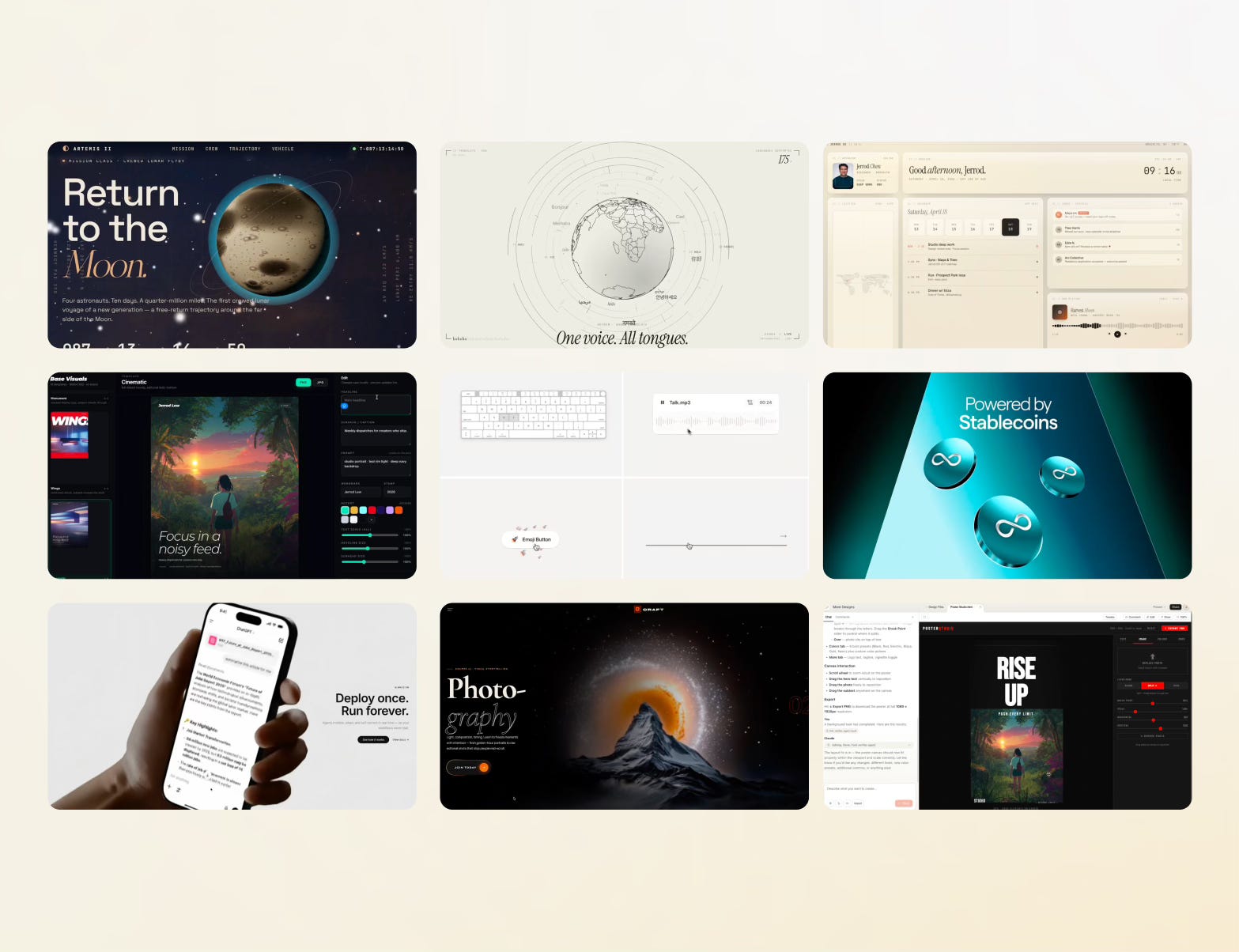
The examples
10. Peter Yang turned the Claude Design blog post into a 30-second video. Just pasted the text in.
9. Viktor Oddy built a landing page with scroll-based animations.
8. Enodrift built a hero section with a working carousel.
7. Basit A. Khan created a smooth transition between mockups. Clean motion, no code.
6–5. @kail_designs made a stunning video and interaction animations.
4–3. Jerrod Lew explored poster design and dashboard interface concepts.
2. liu8in created visual “design planets” — explorations that feel more like art than UI.
1. Artemis II moon launch site — a full website design concept, built in Claude Design.
What the pattern shows
Nobody built a typical app screen. Nobody submitted a Figma handoff file.
The dominant use case was video. Motion. Things that used to require After Effects and three days.
What this means for designers
Claude Design is closing the gap between UI, graphics, and motion in a single tool. And unlike every other AI generator, it asks for your style and component library before it builds anything.
My take
I still don’t think it’s the best tool for UI generation.