
When AI shows only the answer, the product feels broken (The blackbox effect)
Your model works. Your UX does not. Here is what to fix first.

A lot of AI products fail in the same place: not the answer. The waiting.
The system works. The result may even be correct. But users still think it failed, because they saw nothing while it was working.
A fresh n8n issue captured this perfectly.
Here’s what’s inside:
🤫 Why silence makes working AI products feel broken
🔍 What the n8n issue reveals about trust in AI workflows
🧭 The 3 things good AI UX should always show
🛠️ What product teams should fix first
A fresh n8n issue captured this perfectly.
The complaint was not that the agent gave the wrong answer.
It was this:
Only the final result is sent back to the system that made the request.
That’s the whole problem.
The user sends a request into an AI workflow.
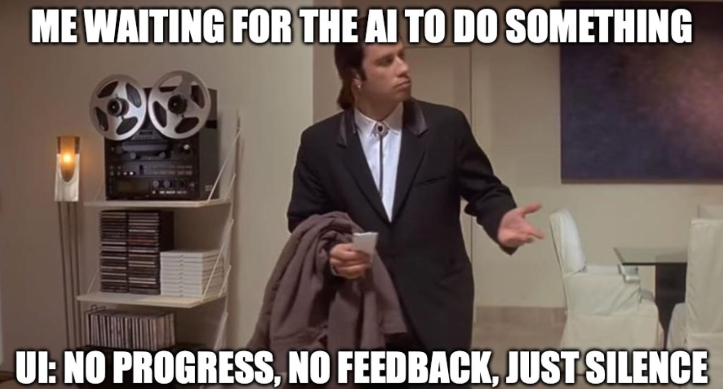
Then nothing.
🚫 No progress
🔄 No intermediate steps
💀 No sign the system is alive
Just silence.
And silence makes “working” and “broken” feel the same.
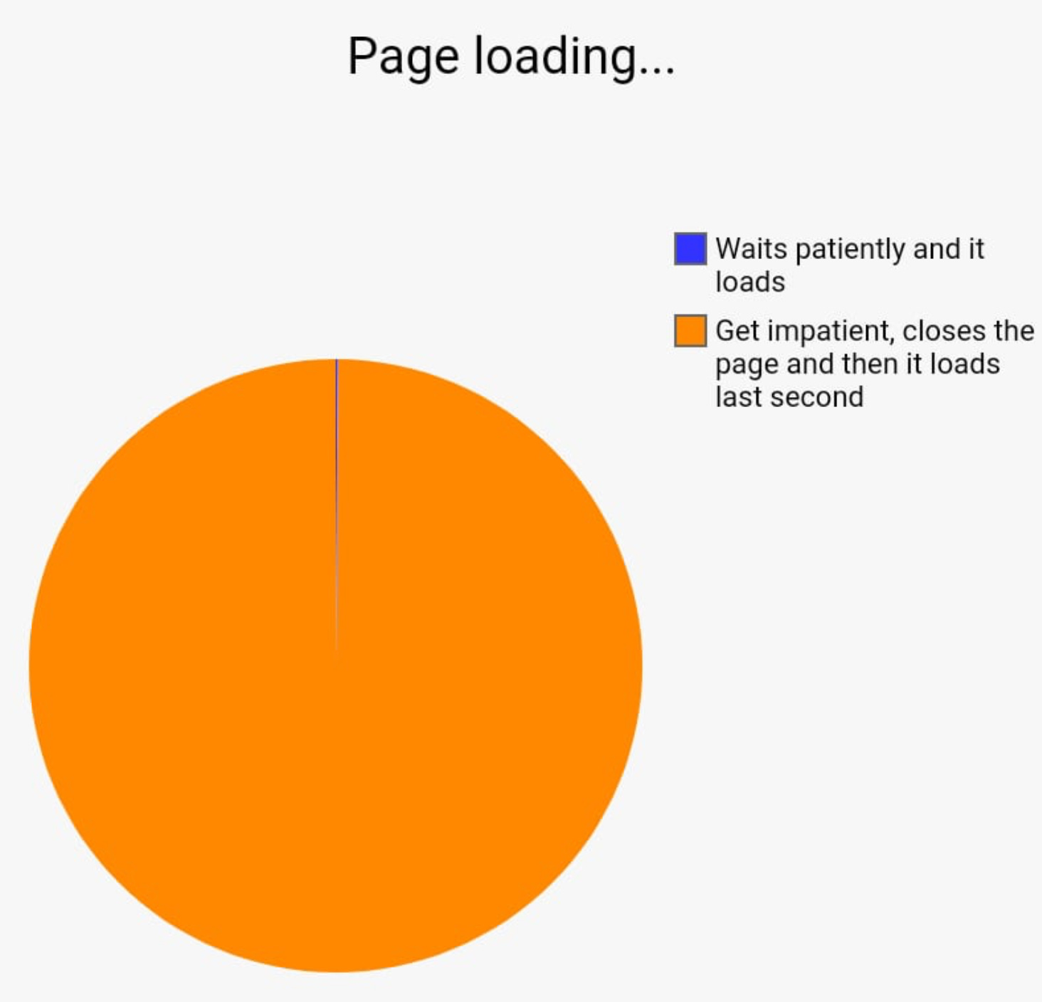
This is the part many teams still miss:
AI products do not only need to be correct. They need to feel understandable while they work.
Users are not evaluating your architecture.
They are evaluating the experience of waiting.
That is why better models alone won’t fix this problem.
A smarter answer does not help if the product feels frozen before the answer appears.
The old UX rule still applies:
Feedback beats silence.
If something takes time, people need signals.
Not raw chain-of-thought.
Not internal tokens.
Just enough clarity to answer:
Did my request go through?
Is it still working?
What step is it on?
Should I wait or retry?
The best AI UX usually shows three things:
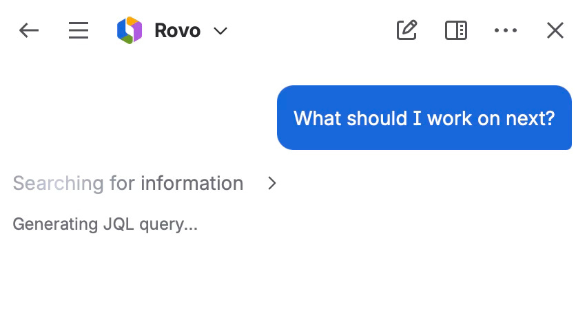
1. State
What is happening right now?
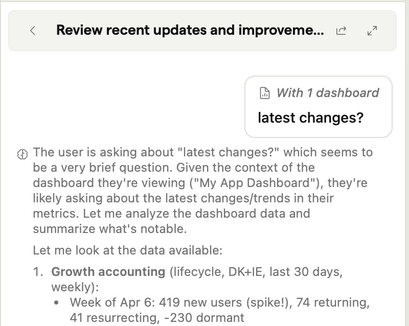
2. Direction
What is the system trying to do?
3. Recovery
What happens if it gets stuck or fails?
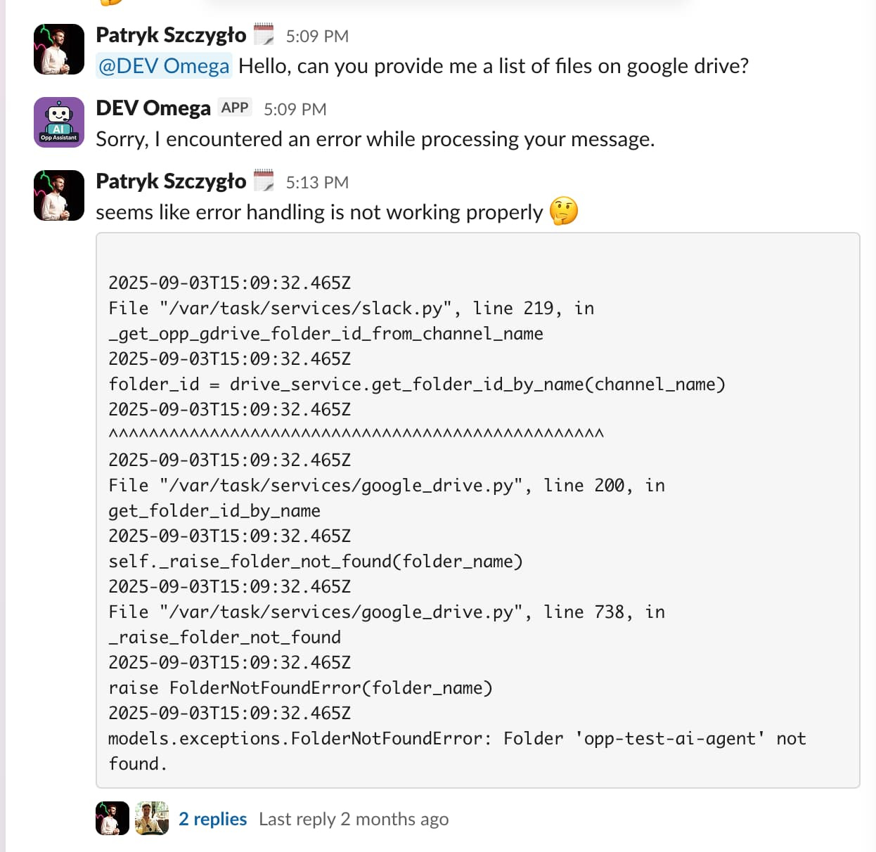
Most products barely do the first one.
They show a spinner which says the machine is busy, not whether it’s useful.
The strongest AI products already feel different.
What “good AI UX” actually looks like
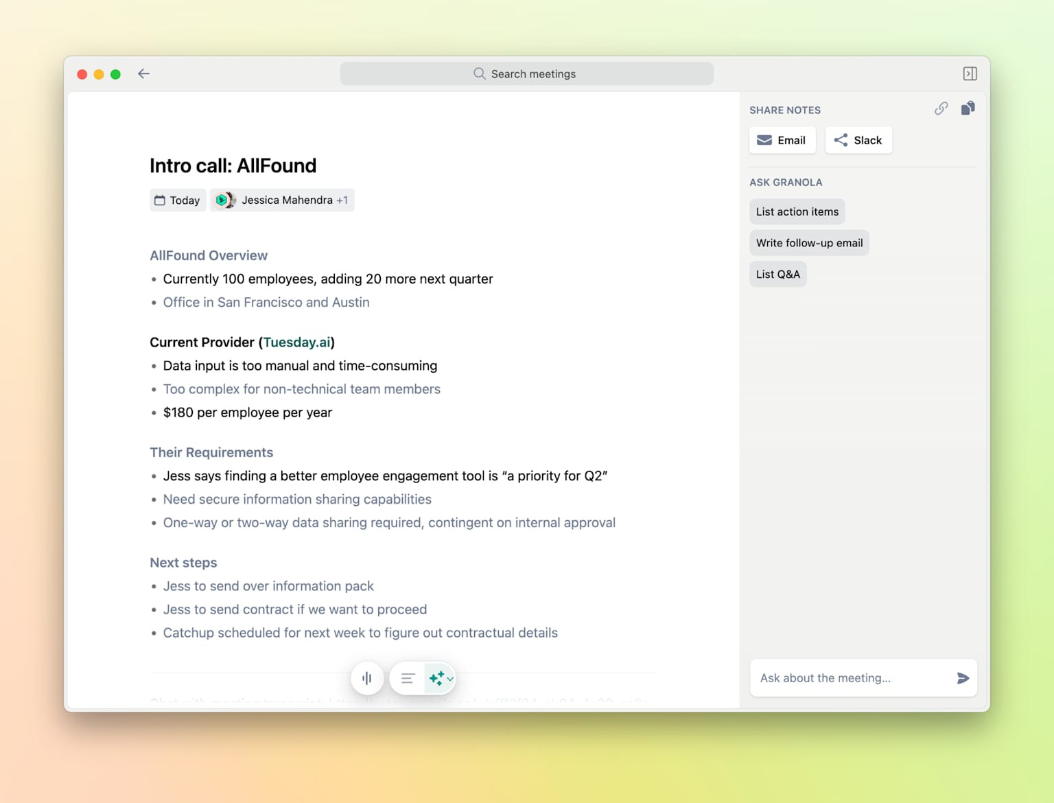
Granola: invisible AI with 70% retention
Granola does not join your call. It does not pop up. It does not ask you to learn a new workflow.
It sits there like a notepad. After the meeting, it turns your half-baked bullets into clean notes. Decisions, action items, links back to the exact moment in the transcript.
70% retention. Not from flashy features. From removing the anxiety of “did I miss something important?”
Cursor: when “less AI” wins more trust
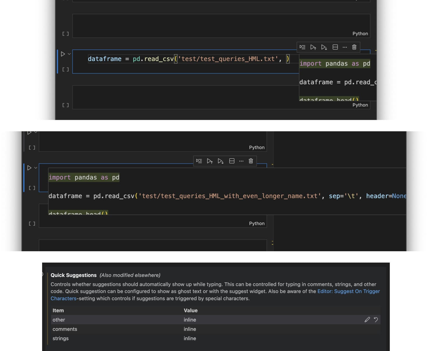
Cursor shipped a Tab model that made 21% fewer suggestions. Accept rates went up ~30%.
They did not make the model smarter. They tuned when it speaks.
The real upgrade was not a new sidebar. It was restraint.
The real UX upgrade wasn’t a new sidebar. It was restraint.
GitHub Copilot: AI that lives in the flow
Developers using Copilot finished a coding task 55% faster. They also reported higher satisfaction.
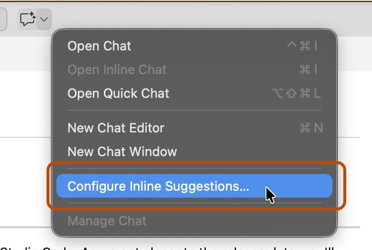
Notice what Copilot does not do. It does not open a new app. It does not launch an agent view. It appears inline, one keypress away, and disappears when you do not need it.
Boringly embedded. Absurdly fast. Never asking for your full attention.
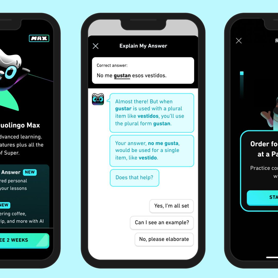
Duolingo Max: AI that explains, not just corrects
Adults do not just want to know they are wrong. They want to know why.
Duolingo built two GPT-4 features around that truth. Tap any sentence, get a targeted explanation. Roleplay a conversation, get specific feedback on what you said.
It turns a black-box “you’re wrong” into a clear, motivating explanation.
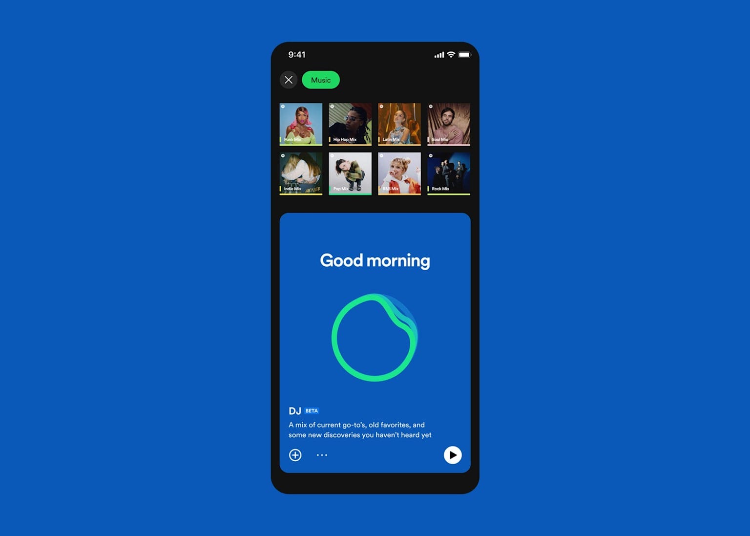
Spotify DJ: Personalization you can actually feel
Spotify’s AI DJ helped drive a 15% lift in retention. It did not just queue songs. It talks to you. It tells you why it picked this track. It adjusts to time of day and listening patterns.
The personalization is visible. Not just “the algorithm did something.”
Good AI products make invisible work understandable.
If your AI takes more than a few seconds, your job isn’t just output quality—it’s trust design.
Because once users think:
It froze
It ignored me
It’s random
You’ve already lost confidence.
AI UX is becoming the real advantage. Not just models, speed, or distribution—clarity.
The winners won’t be the most magical demos.
They’ll be the ones that make systems feel understandable.
Ask yourself:
Where does the user experience silence?
Fix that first.
Because hidden progress kills adoption.
Key takeaways
🤐 Silence makes working AI feel broken
🧭 Strong AI UX needs state, direction, and recovery
🧠 Trust is a product-design problem, not just a model problem
💬 Feedback is now part of the product, not just polish

Excellent post and super useful information. Will think about and incorporate the learnings into my own projects.